Elekta
Project
An internal campaign to promote the business’s five core pillars. I worked on the creative for the campaign on behalf of Space Worldwide and we proposed three concepts.
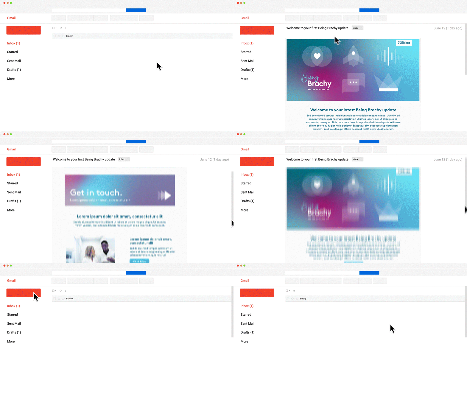
Each route showcases a potential campaign strategy with it’s own unique name and identity, supported by a visual look and feel that we have visualised across the touchpoints we ultimately needed to produce - posters, video and emails. The client ultimately went with concept three
Brand identity, positioning, strategy, print and digital design, illustration and concept.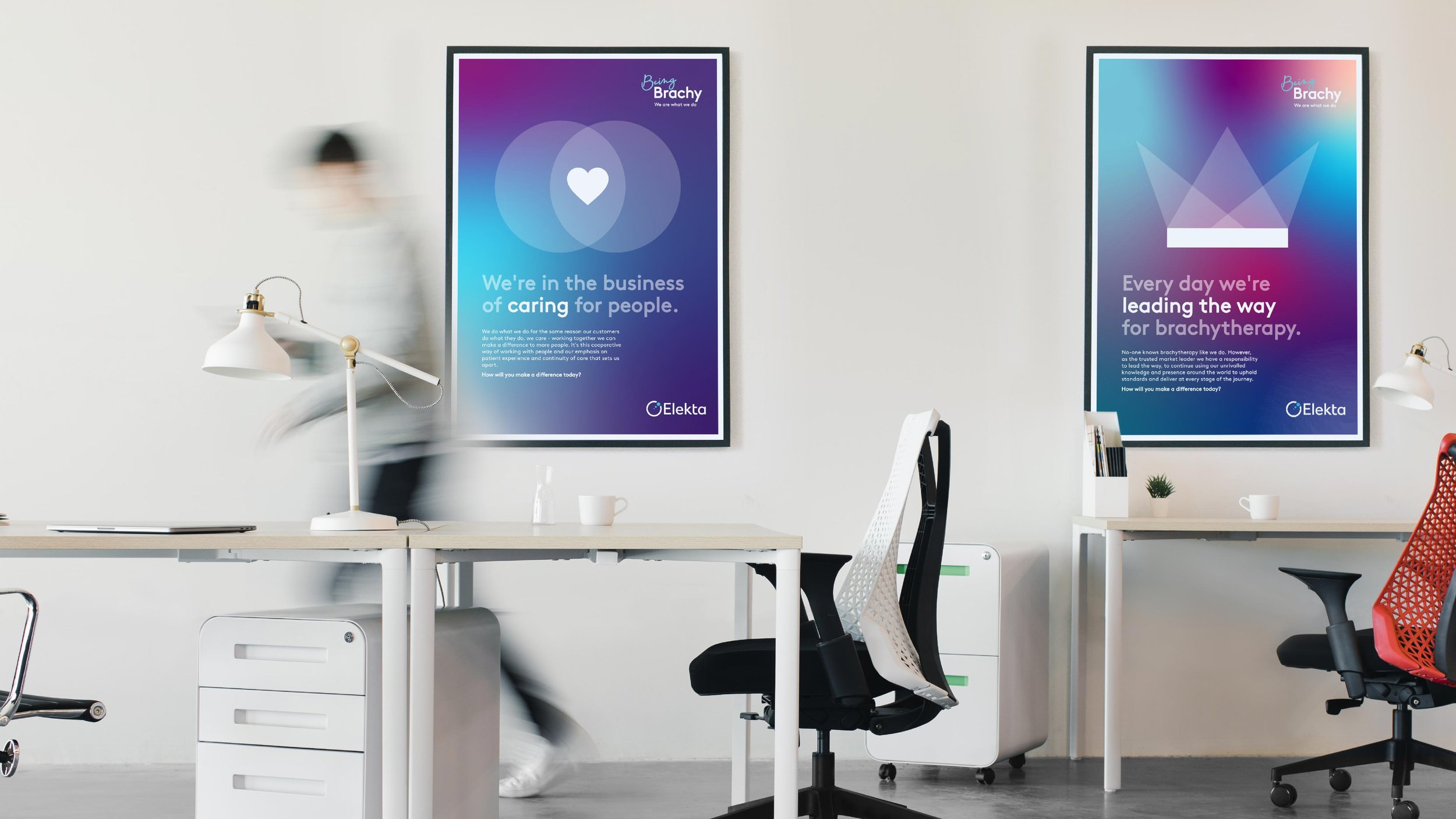
Creative route one
Through an abstract, bold visual language that is both fresh, yet indisputably Elekta,
we looked to create a shared sense of pride in brachytherapy and the qualities that will ensure future success. Each business pillar is reflected in a bold icon that would then create it’s own visual language. The styling ties into the proposition of ‘Being Brachy’ by showing how the employee should feel, bold innovative and easy to understand.
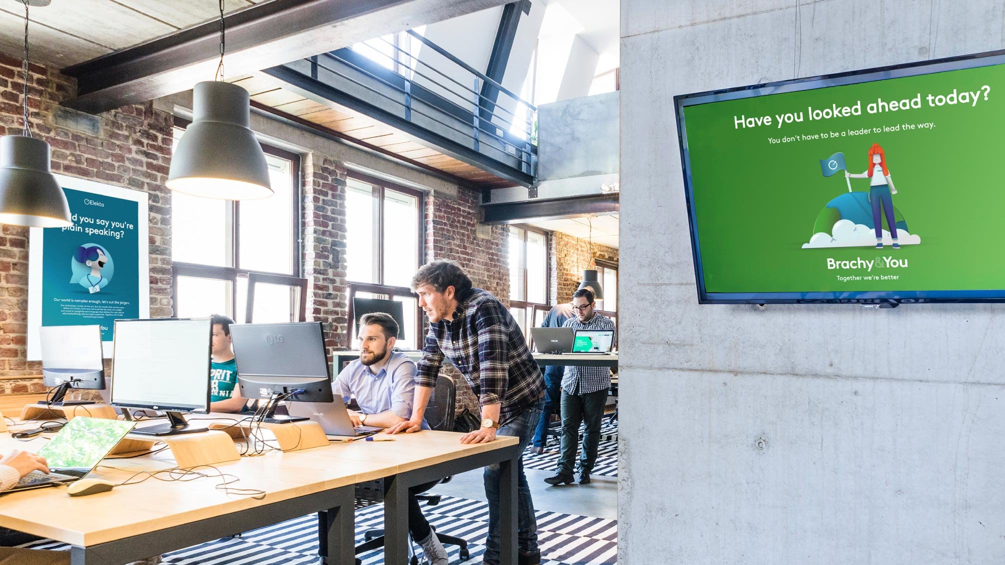
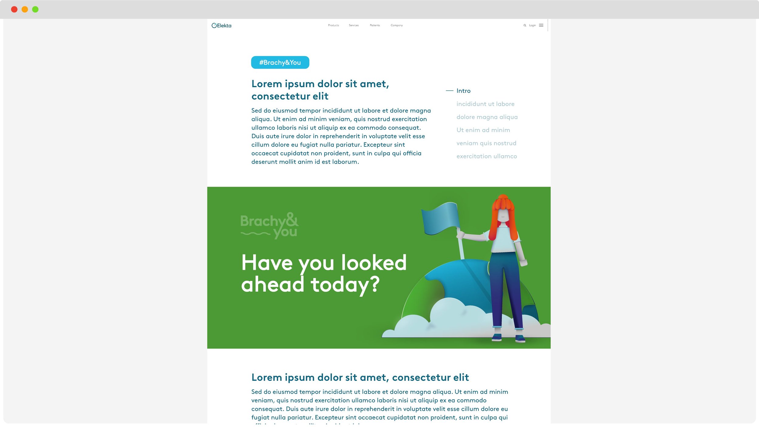
Creative route two
This route seeks to engage the internal audience with a fresh and fun style that grabs attention and encourages them to see themselves, and the part they can play, in a different light. The idea is to focus on the people, fun and passionate element of their business. “Brachy&you” is a much more intimate approach, that tries to speak directly the employees by being warm and engaging and to make life around the office feels less tense as the subject is so heavy.
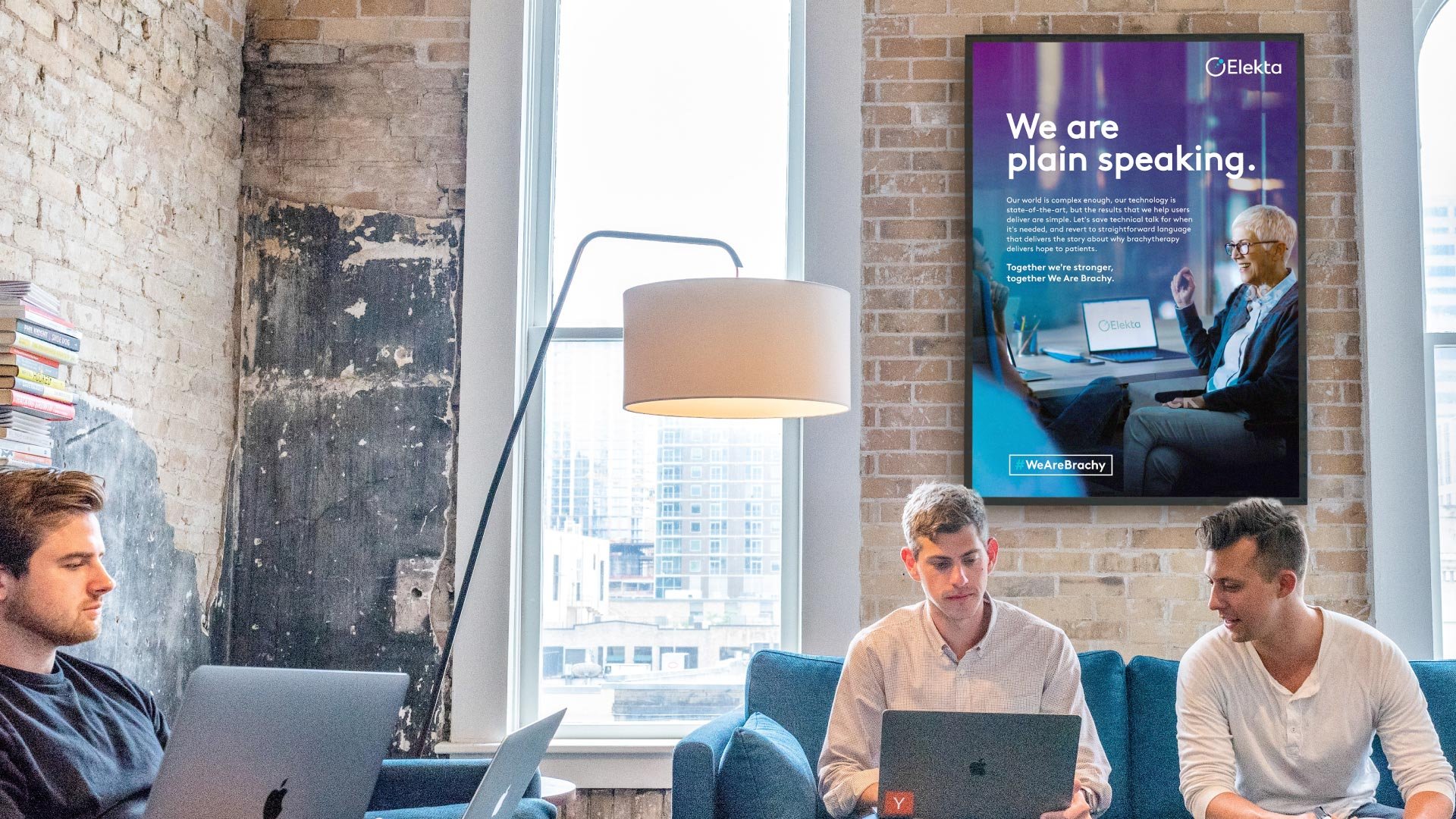
Creative route three
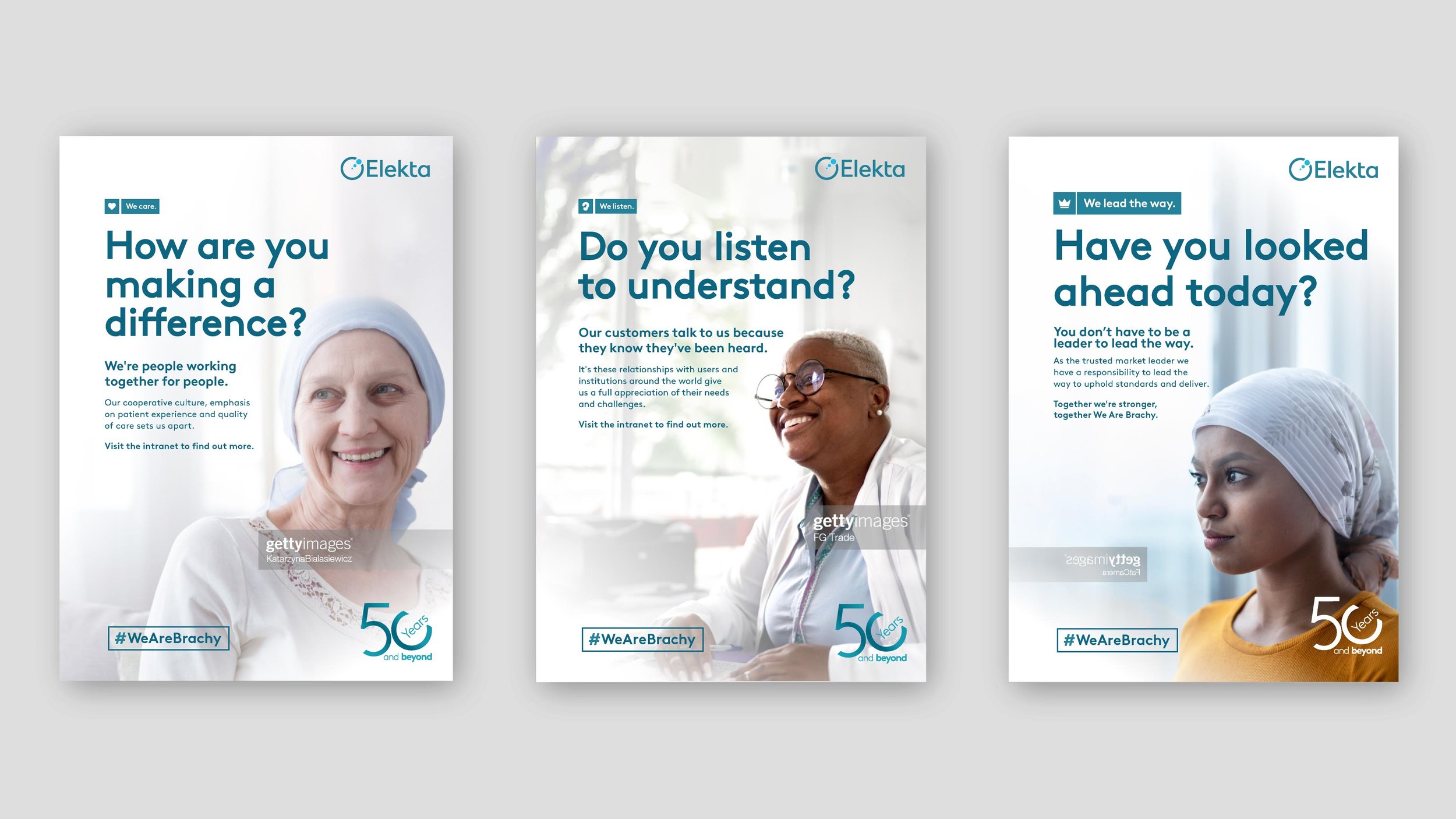
A confident, direct tone of voice pairs with distinctive, cinematic photographic visuals to bring the shared qualities and messages to life for every individual within Elekta brachytherapy. This approach still leans into the people focus however is subtly different with cinematic yet abstract imagery that isn’t necessarily as warm as the previous route but still upholds the intrigue.
And within the concept, ultimately there were three potential routes, one focused on their employees, one conceptually abstract and the final one - the one which the client ultimately went for was the abstract but still easily understandable photographic route.
#WeAreBrachy is to actually put the people who work there front and centre, showing real people in real situations and bringing them altogether with a hashtag that they can mutually get behind.


